Guide to Using the Button Block
Content:
- What is a Button Block and How to Use It?
- Adding a Button to Your Email
- Types of Links You Can Add to a Button and How to Add Them
- How to Change the Button Text
- Creating a Button with an Icon
- Adjusting the Size of Your Button
- Setting the Color and Border for Your Button
- Configuring Hover Color for Your Button
- Styling and Changing the Text Color of Your Button
- Altering the Background Color and Border Under the Button
- Adjusting Button Alignment and Padding
- Hiding the Button Block on Desktop or Mobile Devices
- Mobile Settings for the Button Block
- Dark Mode Settings for the Button Block
What is a Button Block and How to Use It?
A button is a crucial element in an email, used for directing the reader to a specific page on your website, as well as serving as a Call To Action (CTA) indicating what the user should do on that page. It's a key component in boosting email conversion rates.
Using a button is straightforward—simply add it to the necessary places within your email. For example, use it for directing readers to a product you're discussing, to complete a survey, finalize an order, or other objectives for which you're sending the email. We advise against using too many buttons with different CTAs, as it can confuse recipients about what is expected of them. However, you can replicate the same button at both the beginning and end of the email to increase the likelihood of it being clicked.
Adding a Button to Your Email
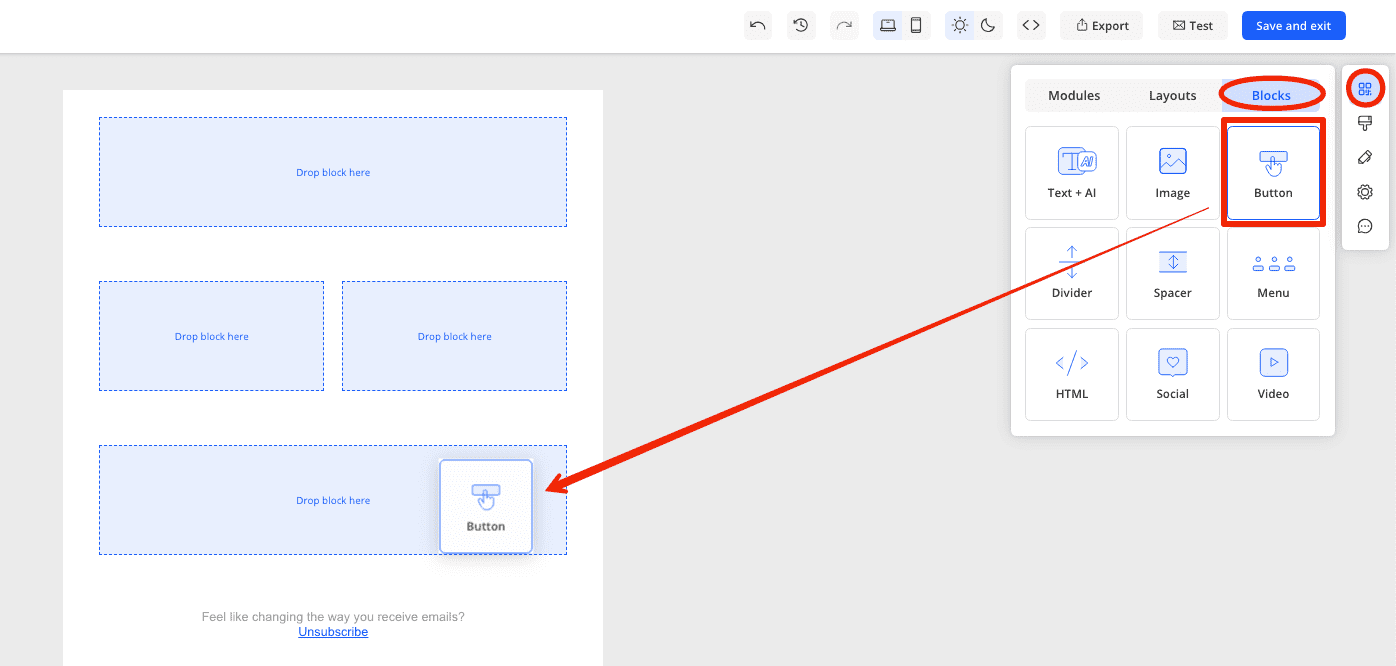
To add a button block to your email, navigate to the 'tools & modules' section and go to the 'blocks' tab. Click and drag the button block to the desired location in your email.
Types of Links You Can Add to a Button and How to Add Them
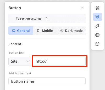
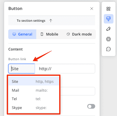
To add a link to a button, click on the button block within your email and in the settings panel on the right, under the content section, add the desired link next to the button link item.
You can add various types of links, depending on your goal:
- A website link in the https format (clicking will open the website in a new tab).
- An email address (clicking the link will open the client's email service to send an email to the specified address).
- A telephone number in the tel format (clicking the link will open a dialer with the specified number).
- A Skype username (clicking the link will open the Skype application to call the specified username).
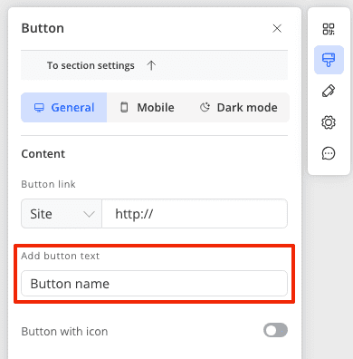
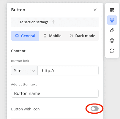
How to Change the Button Text
To change the text displayed on the button, click on the button block within your email, and in the right-hand settings panel, under the content section, enter the desired text for the button.
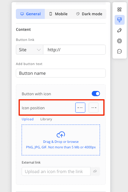
Creating a Button with an Icon
To create a button featuring both an icon and text, activate the toggle in the button block settings next to "Button with icon."
This will open the icon settings. You can upload an icon image from your computer, via a link, or select it from the library.
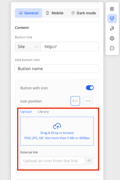
Additionally, you can edit the icon's position relative to the text - either on the left or the right. The setting for this is located above the image upload option.
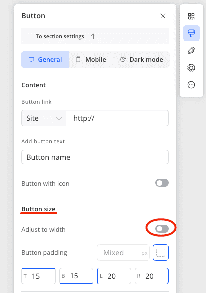
Adjusting the Size of Your Button
In Markeaze, the size of the button is determined by internal paddings, not external ones. Essentially, the paddings for button size refer to the space from the text inside the button to its edges.
To edit the size of the button, click on the button block within your email and in the right settings panel, under the section "button size," set the values for the button's paddings.
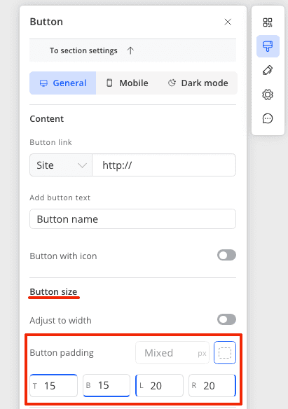
You can also make the button stretch the full width of the section. To do this, activate the toggle next to "Adjust to width" in the "button size" section
Setting the Color and Border for Your Button
To set the color of the button, click on the button block within your email and in the settings panel on the right, find the section labeled "button style." There, you can set the button's color in hex format.
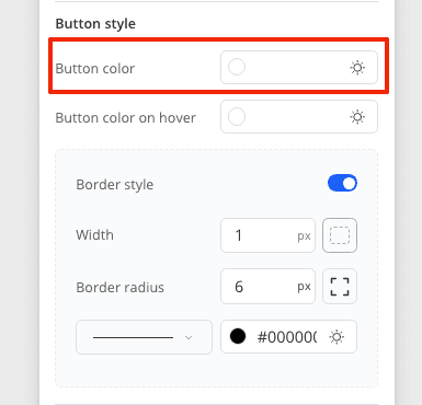
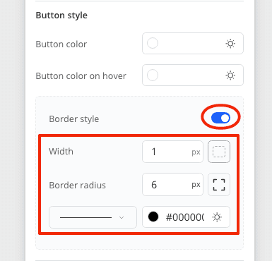
To change the border of the button, in the button block settings under "button style," enable the border settings and set the style, color, thickness, and corner rounding of the border.
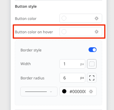
Configuring Hover Color for Your Button
The hover feature for a button refers to the color change when the mouse hovers over the button while viewing the email. To enable this feature and set the hover color, click on the button block and in the right-hand settings panel, under "button styles," set the color for the hover in hex format. Without values in this section, the button will not change color when hovered over.
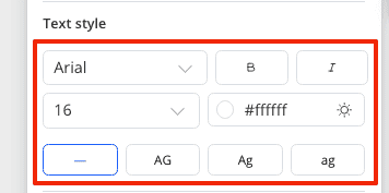
Styling and Changing the Text Color of Your Button
To change the style and color of the text on your button, click on the button block and in the settings panel on the right, find the "text styles" section. Here, you can set the font, weight, italicization, size, and color for the button's text. In this section, you also have the option to make all the text uppercase or lowercase.
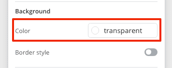
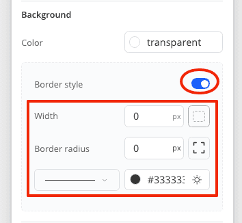
Altering the Background Color and Border Under the Button
You can edit the background located under the button and its border. To do this, click on the button block and in the settings panel on the right, find the "background" section. Here, set the background color in hex format.
To edit the border settings, enable them and in the panel below, adjust the style, weight, color, and corner rounding of the background border.
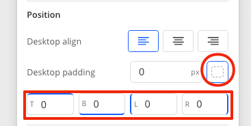
Adjusting Button Alignment and Padding
To change where the button will be located within a section - to the right, left, or center, you can edit the block alignment. For this, click on the button block and in the block settings on the right, find the "Position" section and select the alignment for the block.
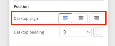
In the "Position" section, you can edit the button paddings - the distance between the button and the edge of the section on the sides of the button.
Hiding the Button Block on Desktop or Mobile Devices
You can hide the display of the button on mobile or desktop devices. Read how to do this here.
Mobile Settings for the Button Block
In the mobile version of the editor, you can modify certain parameters of the button for optimal display of your email on mobile devices:
Read more about the mobile settings of the button here.
Dark Mode Settings for the Button Block
To achieve the best appearance for your email in dark mode, we recommend configuring the button separately in the dark version of the editor. There, you can change:
- the color of the button
- the hover color of the button
- the border color of the button
- the text color of the button
- the background color of the button
For more information on button settings in dark mode, read here.