Mobile Mode Section Style Changes
Content:
- What Settings Can Be Changed for a Section in the Mobile Version?
- How to Make Columns in a Section Stack Vertically in the Mobile Version?
- How to Enable Column Inversion in a Section in the Mobile Version?
- How to Change the Size of Columns in a Section in the Mobile Version?
- How to Change the Padding of a Section in the Mobile Version?
- How to Change the Distance Between Columns Within a Section in the Mobile Version?
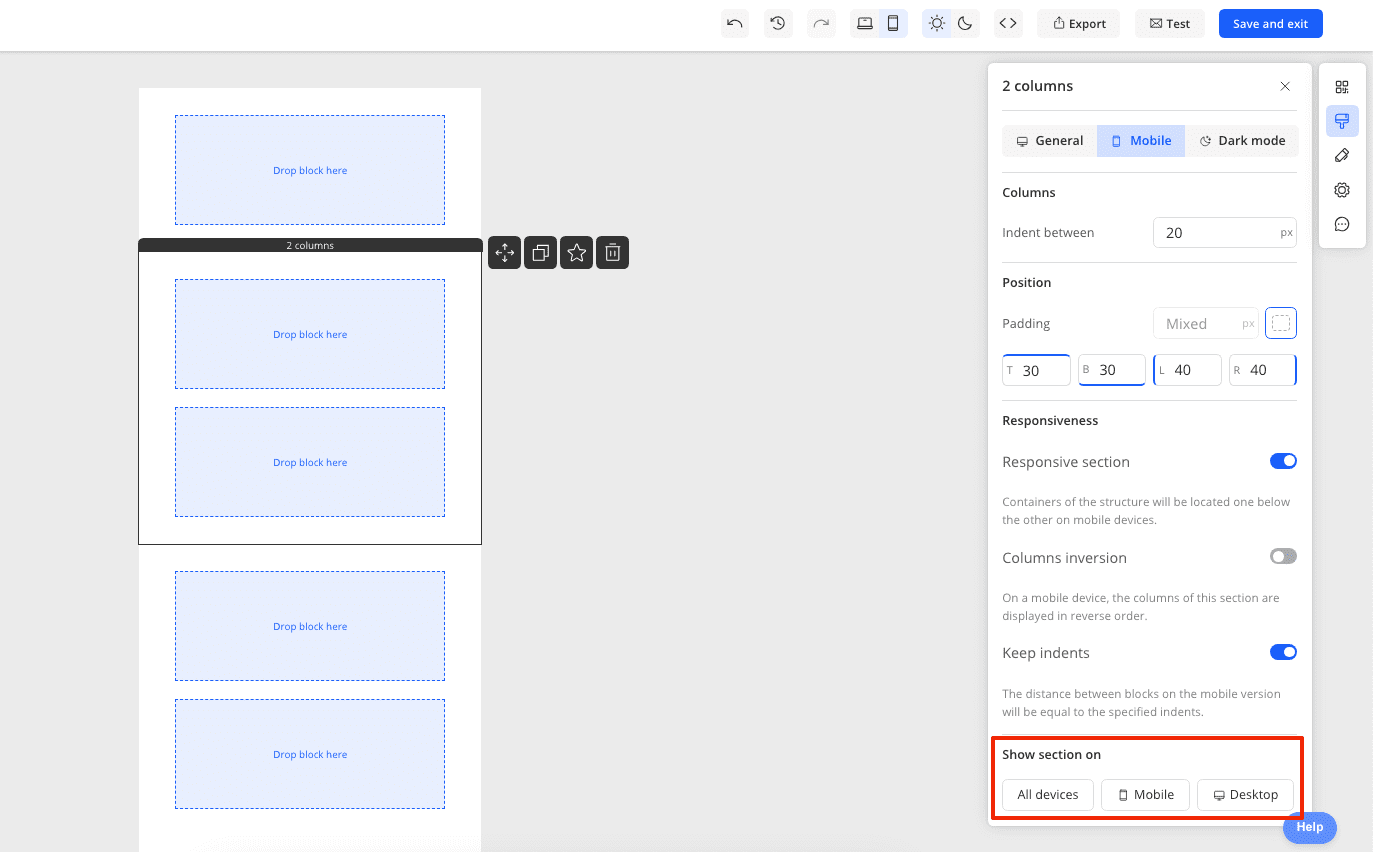
- How to Enable or Disable the Display of a Section in the Mobile Version?
What Settings Can Be Changed for a Section in the Mobile Version?
For optimal display of sections in the mobile version of emails, Marquis offers a range of settings, specifically:
- Enabling and disabling section responsiveness (when enabled, blocks within the section will be stacked one under the other).
- Enabling and disabling column inversion (to change the order of columns in sections with 2 columns).
- Changing the size of columns (if you have disabled responsiveness and the columns are side by side, you can edit their size).
- Padding on the sides of the section content.
- Distance between columns within the section.
- Enabling or disabling the display of the section on desktop or mobile devices.
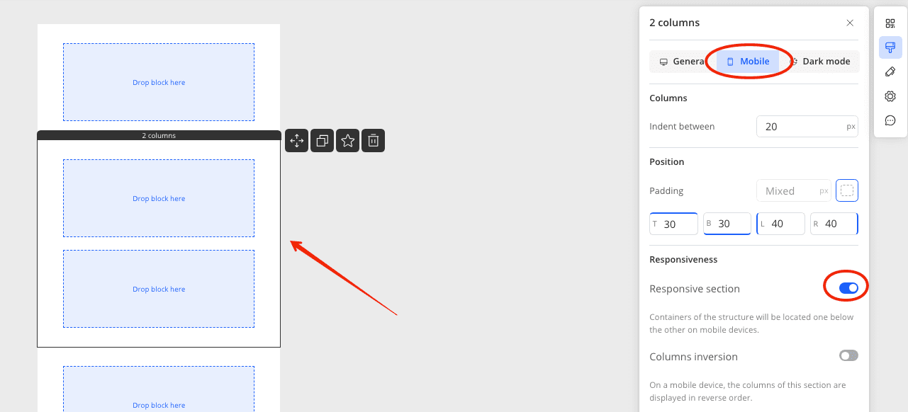
How to Make Columns in a Section Stack Vertically in the Mobile Version?
This option is controlled by the responsiveness setting in the section settings. To enable or disable this setting, go to the mobile version of the editor, click on the section, and in the right panel, swipe the toggle next to Responsive section.
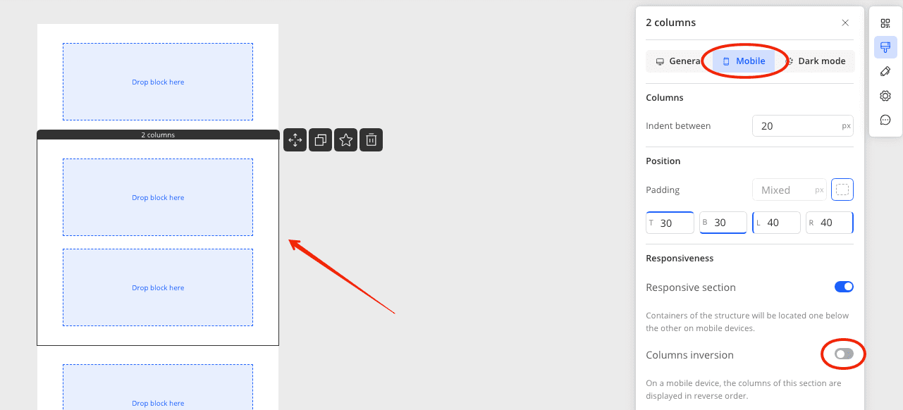
How to Enable Column Inversion in a Section in the Mobile Version?
To change the arrangement of columns within a section in the mobile version of the email, go to the mobile version of the editor and click on the section. Swipe the toggle next to Columns inversion.
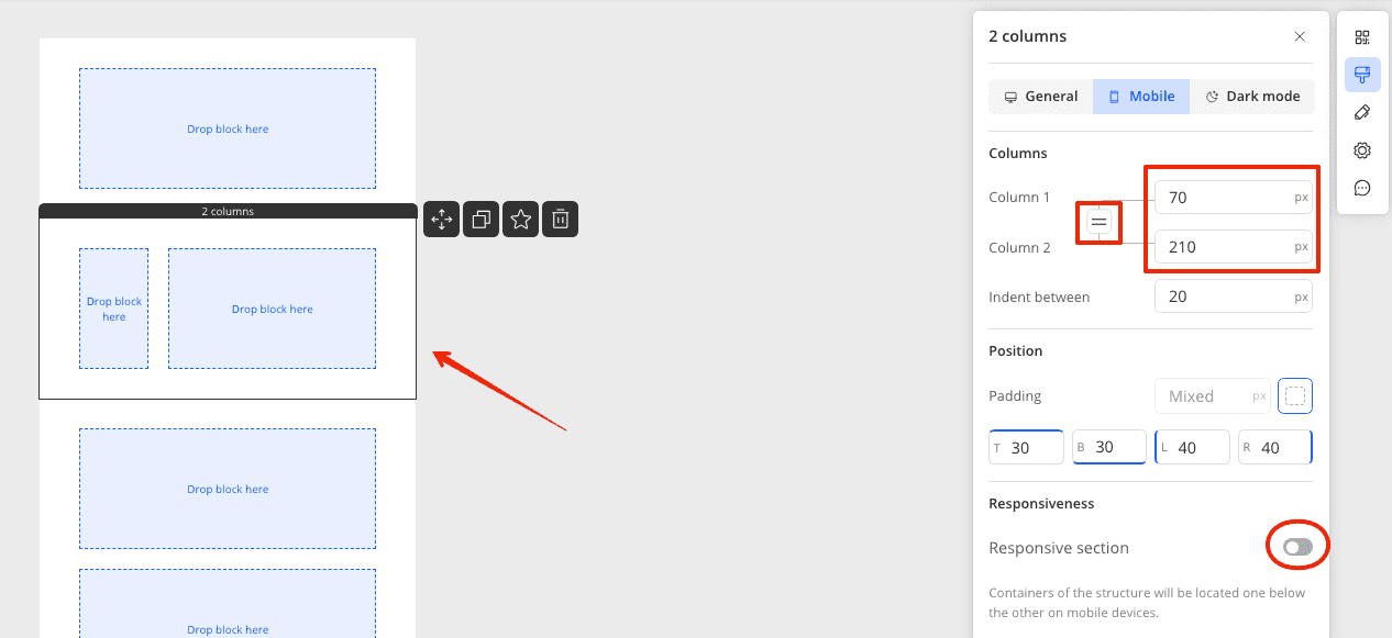
How to Change the Size of Columns in a Section in the Mobile Version?
To change the size of the columns, go to the mobile version of the editor and click on the section. In the right panel, disable responsiveness for the section, after which a window for editing column sizes will appear at the top of the panel. Set your values or align the columns by pressing the '=' sign.
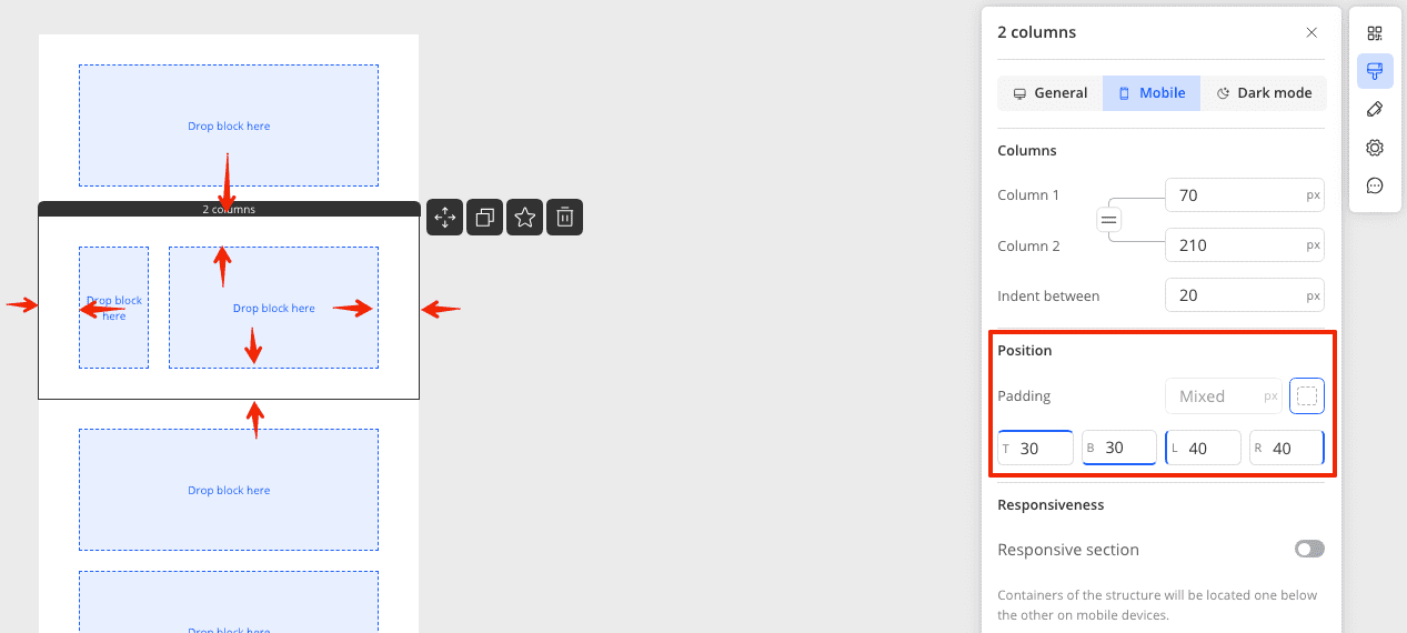
How to Change the Padding of a Section in the Mobile Version?
To change the spacing between the content inside the section and the edge of the email, go to the mobile version of the email and click on the section. In the right panel, under paddings, set the desired values.
How to Change the Distance Between Columns Within a Section in the Mobile Version?
To change the space between columns in the mobile version, enter the mobile version of the editor and click on the section. In the right panel, set values in the indent between field.
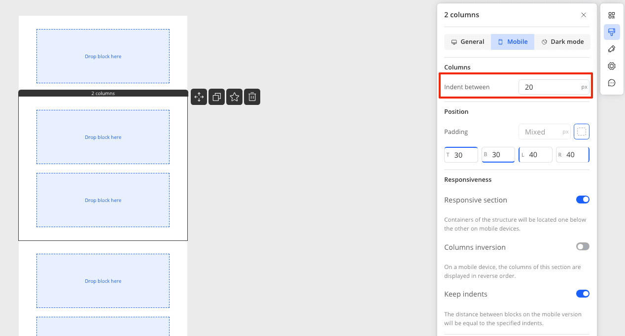
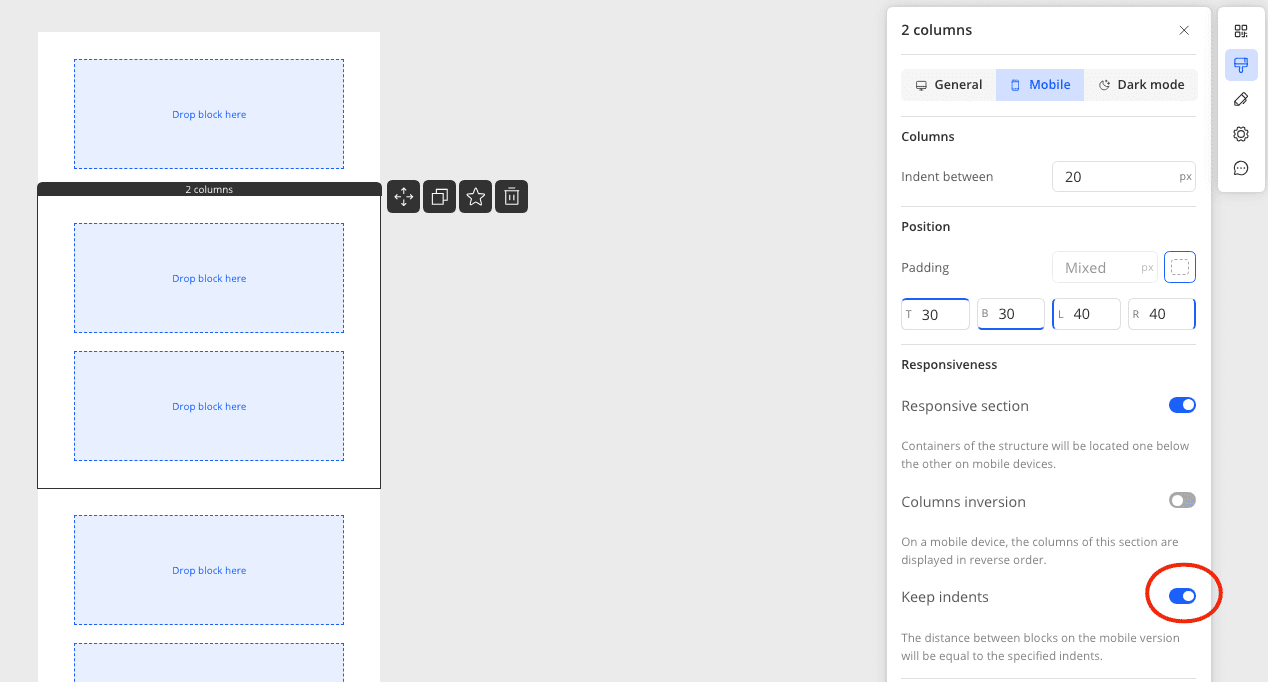
You can also make the indent the same as in the desktop version of the email by enabling the corresponding toggle on the panel.
How to Enable or Disable the Display of a Section in the Mobile Version?
Go to the mobile version of the editor and click on the section. In the right panel under Show section on, select the devices on which the section should be displayed. By default, the section is displayed on all devices.