Email Sections Explained
Content:
- What is a Section and How to Use It?
- How to create, move, delete or turn section into the pre-made module?
- Settings for a Section in Light Theme
- Dark Mode Section Style Modification
- Mobile Mode Section Style Changes
- Hiding Sections in Templates
What is a Section and How to Use It?
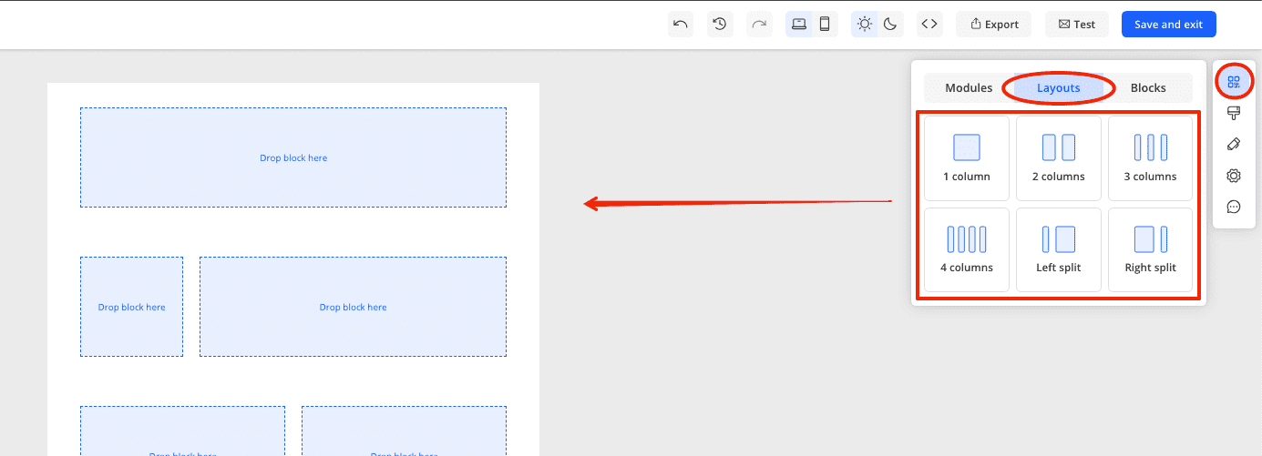
A section in emails is an element for nesting content. A section consists of 1, 2, 3, or 4 columns, which can be configured in width, and each column can contain a content block (for example, text, an image, or a button).
A section is also used for logical separation of content. For example, in an email, it usually goes:
- First section - logo
- Second section - menu
- Third section - bannerand so on.
In Markeaze, sections are selected in the layouts tab under the tools & modules section (the first icon at the top on the right panel). Here you can choose the number of columns and their arrangement.

How to create, move, delete or turn section into the pre-made module?
Each of these points is covered in detail in this article. There, you will learn how to add a section, copy, move, delete, or create a module from a section.
Settings for a Section in Light Theme
When you click on a section, you will see a panel on the right with various settings. Here you can:
- Set the width of the columns and the space between them
- Configure the background (set a color for the section background, add an image to the background, and set up the border for the background)
- Set paddings (spaces between the content inside the section and the sides of the email)
- Enable or disable the display of the section on PC or mobile devices
- Convert the section to HTML
Dark Mode Section Style Modification
You can edit a section in dark mode and change its background color. This can be done in two ways:
- Through Appearance (then the background color will change for all sections).
- Through section settings (then the background color will change only for the specific section).
Mobile Mode Section Style Changes
When switching to the mobile version of the editor and clicking on a section, in the right panel, you will see settings for the mobile section:
- Column size (only if section responsiveness is disabled)
- Indent between (if your section has 2 or more columns). This parameter sets the distance between them vertically (if responsiveness for the mobile theme is enabled) or horizontally (if responsiveness is disabled)
- Paddings (the size of the space from the content inside the sections to the edge of the email)
- Make the section mobile-responsive (Containers of the structure will be located one below the other on mobile devices)
- Enable column inversion (to have them in the opposite sequence)
- Enable saving indents (to keep distances equal to those in the PC version of the email)
- Enable or disable the display of the section on PC or mobile devices
Hiding Sections in Templates
You can hide the display of a section on desktop or mobile devices. This is a useful feature if, for example, a certain section looks great on desktop but not as good on mobile devices, or if you simply do not want that section to be displayed.
How to that that, read here.